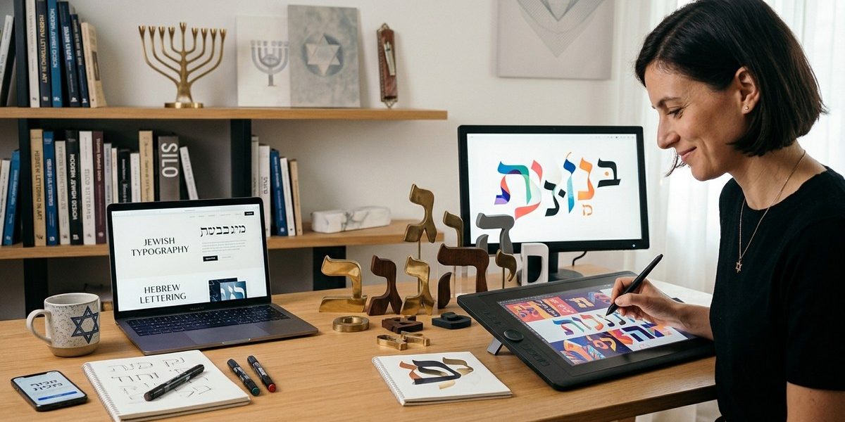
For years, digital design leaned heavily on clean, minimalist Latin scripts. Sans-serif fonts ruled the screen. Then something shifted. Designers started craving texture, history, and a sense of soul in their work. That search led many straight to the elegant curves and deep cultural resonance of Hebrew lettering. It is not just a trend. It is a return to roots, a reclamation of visual identity, and a practical tool for standing out in a crowded visual landscape. Hebrew typography in digital design is making a serious comeback, and for good reason.
Hebrew typography brings a distinct visual rhythm and cultural depth that many digital projects now crave. By understanding the unique anatomy of Hebrew letters, choosing the right fonts for screen use, and respecting the script’s heritage, designers can create work that feels both modern and grounded. This guide covers practical steps, common pitfalls, and expert advice for integrating Jewish lettering into UI/UX, branding, and web design projects.
Why Designers Are Turning to Hebrew Lettering
The move toward Hebrew typography is not random. It reflects a broader shift in design culture. People want authenticity. They want designs that tell a story. Latin scripts, while versatile, often feel neutral. Hebrew letters carry a visual weight that is different. They are built from strong horizontal and vertical strokes. They have a natural rhythm that feels both ancient and fresh.
Brand strategists have noticed. When a brand uses Hebrew lettering, it signals a connection to heritage, craftsmanship, and community. It can make a logo or website feel more human. For Jewish organizations, it is a no-brainer. For secular brands, it can be a powerful way to show cultural awareness and support. The key is to use it with respect and understanding.
Understanding the Anatomy of Hebrew Letters
Before you start designing, you need to know what makes Hebrew letters tick. They are not just backwards Latin letters. They have their own rules.
- The Ktav Ashuri script is the standard square script used in print and digital. It is the most common choice for screen design.
- Ktav Rashi is a more cursive script, often used in religious commentary. It is harder to read on screens and best reserved for special decorative uses.
- The Five Final Forms are letters that change shape when they appear at the end of a word. This is a critical detail that many beginners miss.
- Vowels (Nikkud) are dots and dashes placed around the letters. In modern digital design, they are often omitted for a cleaner look, but they can be essential for proper readability in certain contexts.
Understanding these basics will help you avoid embarrassing mistakes and create work that feels authentic.
A Practical Process for Adding Hebrew Typography to Your Digital Projects
Here is a numbered process to guide you from concept to launch.
- Define the purpose. Ask yourself why you are using Hebrew script. Is it for a Jewish audience? Is it for a cultural campaign? Is it purely aesthetic? Your answer will guide every choice that follows.
- Choose the right font family. Not every Hebrew font works well on screens. Look for fonts that are specifically designed for digital use. They will have better hinting, clearer letterforms at small sizes, and proper kerning. Some popular choices include Frank Ruehl, David, and the open-source Alef font.
- Test readability at multiple sizes. What looks beautiful at 72 points might be illegible at 16 points. Always test your Hebrew text at the actual sizes it will appear on the site or app.
- Pair Hebrew with a compatible Latin font. Most projects mix Hebrew and English. Choose a Latin font that complements the Hebrew one. They should share a similar x-height, stroke weight, and overall mood.
- Check the direction. Hebrew reads right to left. Make sure your design layout supports this. Do not just flip a Latin layout. Reconsider the visual flow entirely.
- Get feedback from native readers. This is the most important step. A native Hebrew speaker will catch awkward spacing, incorrect letter forms, or cultural missteps that you might miss.
Common Mistakes and How to Avoid Them
Even experienced designers make errors when working with Hebrew typography. Here is a table of the most frequent mistakes and how to fix them.
| Mistake | Why It Happens | How to Avoid It |
|---|---|---|
| Using a Latin font that is too heavy next to a delicate Hebrew font | The visual weight does not match, making the pairing feel unbalanced | Choose fonts with similar stroke widths and overall proportions |
| Ignoring the five final forms | Letters like Mem (ם) and Tsadi (ץ) change shape at the end of words | Always use a proper Hebrew keyboard layout that automatically applies final forms |
| Placing Hebrew text in a left-to-right layout without adjusting the grid | The text feels cramped or flows awkwardly | Redesign the layout to accommodate right-to-left reading, or use CSS direction properties |
| Overusing decorative scripts for body text | Scripts like Stam or Rashi are hard to read at small sizes | Use square scripts for body copy and save decorative scripts for headlines or logos |
| Forgetting about ligatures and diacritics | Some letter combinations connect in specific ways that affect spacing | Test your text in the actual browser or app environment before finalizing |
Expert Advice from the Field
“Hebrew typography is not just about the letters. It is about the space between them. The white space in Hebrew script is just as important as the black ink. When you design with Hebrew, you are designing with a rhythm that has been refined over thousands of years. Respect that rhythm, and your work will sing.”
— Mira Gani, type designer and founder of Gani Type Studio
This advice is worth printing out and sticking to your monitor. The rhythm of Hebrew is different. The letters are often more square and upright than Latin scripts. The spacing between words is consistent. The overall texture on the page or screen is denser. Embrace that density instead of fighting it.
Tools and Resources for 2026
The good news is that the tooling for Hebrew typography has improved dramatically. Here are some resources you should know about.
- Google Fonts now includes several high-quality Hebrew typefaces that are free to use on the web. Heebo and Noto Sans Hebrew are solid choices.
- Adobe Fonts has expanded its Hebrew library significantly. You can find professional grade options for both display and body text.
- Custom font services like Fontspring and MyFonts let you license premium Hebrew fonts for commercial use.
- Web tools like TypeRamp and FontForge allow you to tweak and test Hebrew fonts in real time.
If you are working on a major project, consider commissioning a custom Hebrew typeface. It is a bigger investment, but it guarantees that your typography will be truly unique and perfectly suited to your brand.
Designing for Different Contexts
Hebrew typography appears in many different digital contexts. Each one requires a slightly different approach.
- Brand logos and identity. Hebrew lettering in a logo should be bold, memorable, and legible at small sizes. Avoid overly ornate scripts. Think about how the logo will look on a favicon or a social media avatar.
- Website headers and hero sections. This is where you can have fun with larger, more expressive Hebrew fonts. Pair them with strong imagery. Make sure the text contrasts well with the background.
- Body text and articles. For long-form content, prioritize readability. Use a standard square script at a comfortable size (16 to 20 pixels for body text). Use ample line height.
- Social media graphics. Hebrew text on Instagram or TikTok needs to be readable on small screens. Keep it simple. Use bold weights. Add a subtle shadow or outline if the background is busy.
- Email newsletters. Email clients handle Hebrew differently. Test your emails in Gmail, Outlook, and Apple Mail. Use web safe Hebrew fonts to ensure consistent rendering.
The Cultural Weight of Jewish Lettering
Using Hebrew typography is not just a design choice. It carries cultural and historical significance. The Hebrew alphabet has been used for thousands of years for sacred texts, poetry, and everyday communication. When you use it in your design, you are tapping into that legacy.
This is why authenticity matters. Do not use Hebrew lettering as a gimmick. Do not use it to look “exotic” or “spiritual” without understanding what you are doing. Audiences can tell when a designer has done their homework and when they have not.
If you are designing for a Jewish community or organization, take the time to learn about the specific traditions and preferences of that community. For example, some communities prefer very traditional scripts, while others are open to modern interpretations. Ask questions. Listen. Let the community guide you.
For more on how Jewish artists have shaped visual culture over the centuries, check out our piece on how Jewish artists shaped modern art movements in Central Europe. It provides a broader context for understanding the visual language you are working with.
Key Takeaways for Your Next Project
- Start with the purpose. Are you honoring heritage, building a brand, or creating art?
- Choose fonts designed for digital use. Test them at all sizes.
- Respect the right-to-left flow. Redesign your layout if needed.
- Pair Hebrew with a compatible Latin font.
- Get feedback from native speakers before launching.
- Avoid gimmicks. Authenticity always wins.
Where Jewish Typography Is Headed Next
The resurgence of Hebrew typography in digital design is not slowing down. In 2026, we are seeing more variable fonts, more experimental scripts, and more integration with motion design. Animated Hebrew lettering is appearing in video intros, website hero sections, and even app splash screens.
We are also seeing more collaboration between Hebrew type designers and UI/UX teams. The old divide between “print typography” and “digital typography” is fading. Designers now expect their Hebrew fonts to work beautifully everywhere, from a 4K monitor to a smartwatch.
If you are a brand strategist or a designer, now is the time to build your skills with Hebrew typography. It is a differentiator. It is a way to connect with audiences on a deeper level. And it is genuinely beautiful.
Bringing Hebrew Lettering Into Your Creative Toolkit
Start small. Pick one project and try adding a single Hebrew word or phrase. See how it changes the feel of the design. Notice how people react. Then build from there. Learn the letters. Learn the rhythms. Learn the stories behind the shapes. The more you understand, the better your work will be.
Hebrew typography in digital design is not a passing fad. It is a meaningful, lasting addition to the designer’s palette. Use it well, and your work will carry a depth that no Latin font can match.